Summaries & Statistics
Contents
Reports
What are Reports?
When starting a new pain medicine, you will want to check in regular intervals whether it actually relieves your pain symptoms.
Even without new medication it's important to regularly review changes and check whether and how recent diary events may have had an impact on pain symptoms.
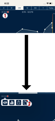
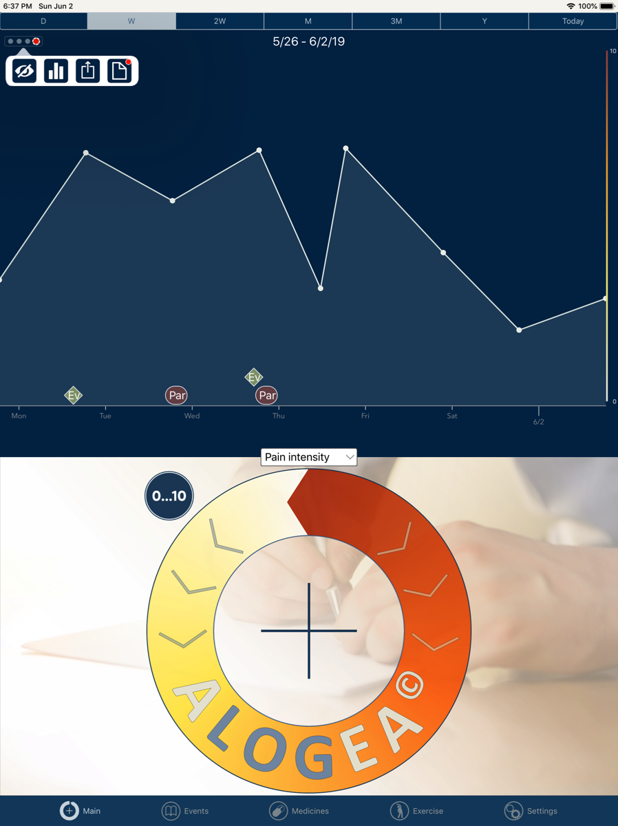
On the recurring weekday start date of your latest medicine you will see a little red dot appearing in the row of four dots in the left upper Main View area (see image for next paragraph).
This indicates that it's time to review the weekly report.
Reports show a summary over the last one or four weeks of
When starting a new pain medicine, you will want to check in regular intervals whether it actually relieves your pain symptoms.
Even without new medication it's important to regularly review changes and check whether and how recent diary events may have had an impact on pain symptoms.
On the recurring weekday start date of your latest medicine you will see a little red dot appearing in the row of four dots in the left upper Main View area (see image for next paragraph).
This indicates that it's time to review the weekly report.
Reports show a summary over the last one or four weeks of
- symptom changes,
- events with possible impact on symptoms
- medication use and effects
To view a Report
Tap on the four dots (1) and then the 'Page' icon button on the right (2).
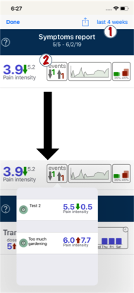
At the top of the Report view select the report's time span. By default this is looking back from now over the last week; you can change this to four weeks by tapping.
Tap on the four dots (1) and then the 'Page' icon button on the right (2).
At the top of the Report view select the report's time span. By default this is looking back from now over the last week; you can change this to four weeks by tapping.
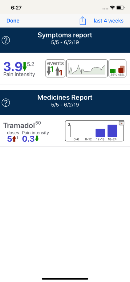
A report has two sections.
The upper section ('Symptoms report') summarises symptom changes.
The info displayed in each row, from left to right, is
For an overview of ALL ratings, not just the last one/ four weeks, use the Symptom Stats view (see below)
The upper section ('Symptoms report') summarises symptom changes.
The info displayed in each row, from left to right, is
- average of your ratings (blue number)
- Change of average compared before the start of the report (green/red arrow)
- Average during the same time span before the report (small gray figure)
- No. of diary events with >10% rating change 24h before compared to 24h after the event
- A plotted graph of your ratings
- Proportions in % of 'mild' = green ratings and 'severe' = red ratings, compared to the proportions form the time before the report
For an overview of ALL ratings, not just the last one/ four weeks, use the Symptom Stats view (see below)
To see a list of events that may have influenced a symptom tap on the 'events' box.
The listed events have either increased or reduced ratings and the blue numbers show the average ratings within 24h before and 24 hours after the event.
The arrow shows increase or reduction.
The listed events have either increased or reduced ratings and the blue numbers show the average ratings within 24h before and 24 hours after the event.
The arrow shows increase or reduction.
The lower section ('Medicines report') summarises your medication use.
The info displayed, from left to right, is
The info displayed, from left to right, is
- number of doses taken
- Change of doses compared to previous report time span (red/green arrow)
- no. of doses taken during the same time span before the report (small gray figure)
- average change of ratings of the treated symptom(s)
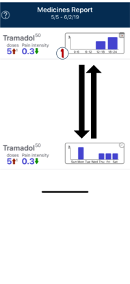
- a chart of dose no. taken on individual weekdays, and - when you tap on the chart…
- a chart of no. of doses taken during times of day.
Symptom stats
What are Symptom Stats?
Symptoms Stats offer a summary and analytic overview for each symptom you track.
Other than a Report Symptom Stats take into account data from your entire diary, not just the last one or four weeks.
Open Symptoms Stats in Main View by tapping on the four dots in the left upper corner, and then the second button with a Chart icon.
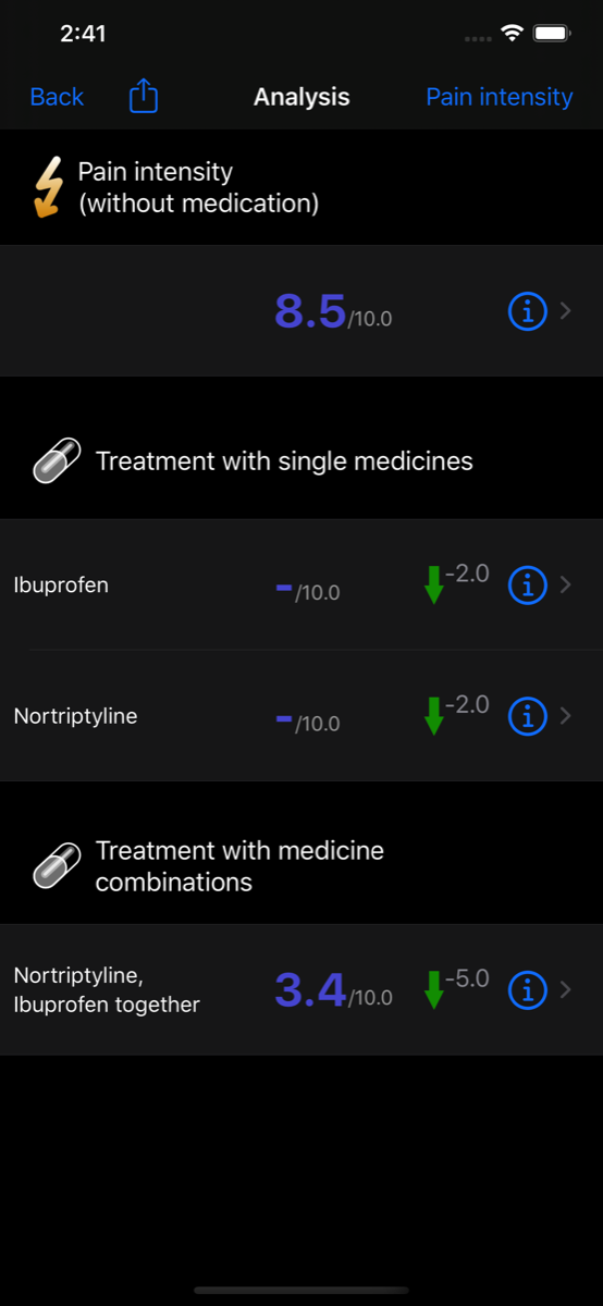
Symptom Stats have a List and a Details view.
At the top the initial List View (shown here in Dark Mode) shows your average rating for the untreated symptom.
Further down, it shows averages during the effect of medicines that treat this symptom.
These can be individual medicines (top part) of combinations of medicines in action together (bottom part).
Apart from average during effect time, Alogea calculates how each dose of a non-regular medicine changed symptom ratings from before to after.
For regular medicines Alogea calculates change of symptom average before starting the medicine compared to afterwards. If there are no ratings before the start, then it calculates the average during first week of treatment as reference to compare to.
Combined medicines in action together may have a different impact than single drugs; Alogea identifies all episodes when a given combination of medicines treating the same symptom were active together and calculates averages from all these episodes.
The average change is shown right of the vertical arrow, with a green arrow colour indicating a reduction of intensity (good) and a red arrow no reduction or an increase (bad).
Tap on one of the rows (untreated symptom or medicine) to see the Detail View.
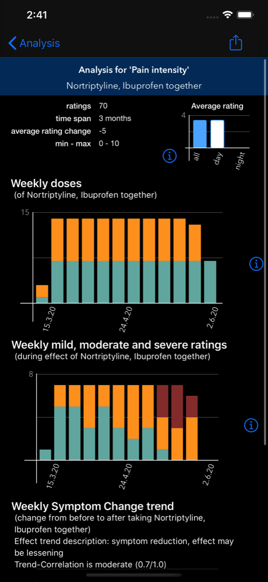
At the top the Detail View shows several infos:
The three charts display information about
The symptom change after dose is calculated btw by comparing the average symptom rating during one hour before you took a dose, to the average of ratings during the effect time of this dose.
- Number of symptom ratings you have made during effect time of this medication
- 'Time span': the time since start of your diary
- the average change of rating from before to after doses
- minimum and maximum ratings during effect time
The three charts display information about
- The number of weekly (or monthly, if you have a more extensive diary) doses taken
- the number of weekly or monthly mild, moderate and severe ratings
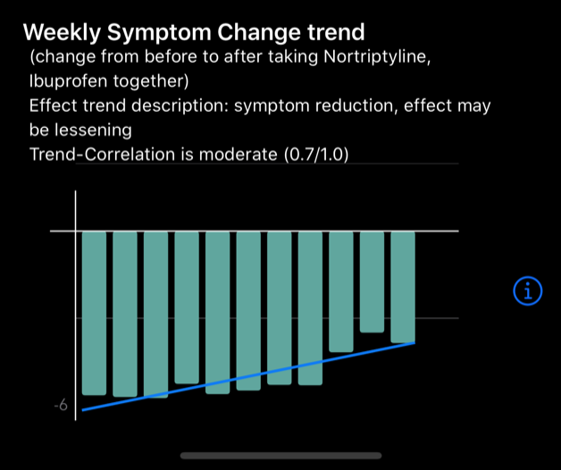
- the weekly/ monthly symptom change after an individual dose, with a blue trend line to estimate effect stability.
The symptom change after dose is calculated btw by comparing the average symptom rating during one hour before you took a dose, to the average of ratings during the effect time of this dose.
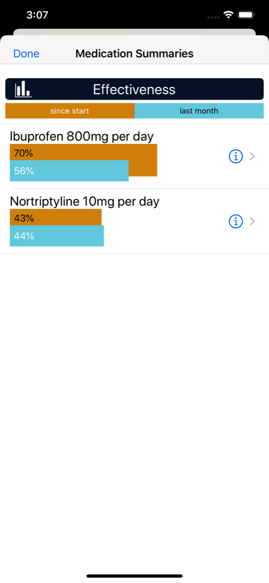
Medication stats
Read about medicine-focussed stats here in the Chapter 'Medicines'
If you did not find an answer to your problem here please contact our support team:
support@apptoolfactory.co.uk
support@apptoolfactory.co.uk